An online food merchant
To better facilitate the product discovery experience, the snack retailer used a faceted search menu on category pages to improve product discovery and increase add-to-carts and purchases. Understanding the importance of testing, the retailer experimented with the style of the menu, number of filters, orders of the filters, placement, and more. Doing so exposed more products and made it easier for shoppers to find items. Additionally, the retailer conducted these tests on mobile devices in order to optimize the user experience on mobile.
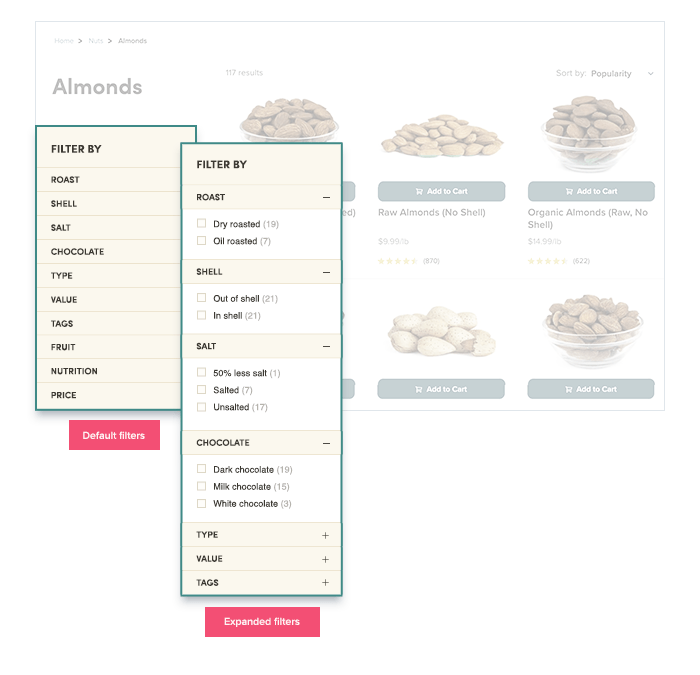
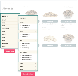
Finding the perfect product efficiently can be a difficult task, especially when companies have thousands of unique products in their inventories. Navigation, therefore, becomes an essential element of site design. In some cases, and for some brands, it makes more sense to have a minimal design that is not too heavy and doesn’t attract too much attention from the user – to a level that would move the focus away from the product listings area. In other cases, having more search filters could improve discoverability and help the user navigate more easily through the product catalog. The retailer wanted to find out just what is the right level of filters and details that should be exposed on category pages, if at all.