![]()
For any marketing effort to be effective and profitable, you have to attract potential customers to the most relevant pages on your site. Converting them into paying customers can sometimes turn out to be a difficult task. Wouldn’t it be nice if the pages your visitors land on would offer exactly what your visitors were looking for in the first place? That’s exactly why we use targeted landing pages.
By acquiring traffic via dedicated landing pages, we could potentially increase the likelihood of converting that traffic into paying customers.
In online marketing, a landing page is defined as a web page that serves as the first page the visitor has landed on when he or she visits your site. A landing page could be the page the user has landed on after clicking on a Google search result, or after clicking on links from other sites, paid media banners, social media posts, email links, and so on. For example, when you advertise on Google Ads, your ads’ destination URLs act as landing pages.
A landing page usually includes a clear call-to-action tied to a desired primary objective, such as capturing leads, generating sales, increasing sign-ups, driving content downloads and such. Regardless of the specific objective, typically, the wider goal remains the same: To convert visitors into qualified customers.
Continuous optimization to the layout, copy, and design of your landing pages, to improve the overall landing page experience and relevancy to the specific target audience, are essential steps in order to guarantee high conversion rates and better performance.
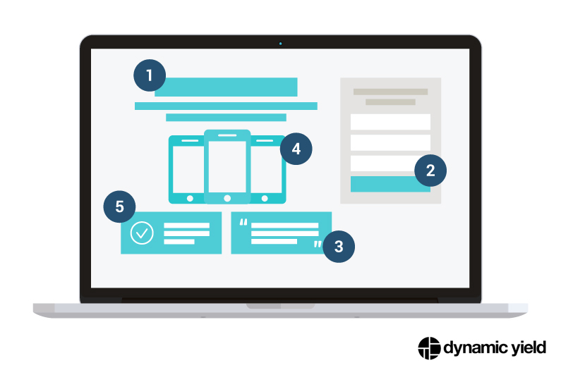
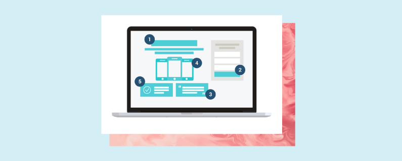
Create a clear and engaging copy that will inspire your prospects to take action. Build their trust and confidence in a clever and creative way. Write for them; not to them. Show off your benefits before the features, and explain what you can do for your clients. Format your headlines and body text in a clear layout, making it easy to read and follow by implementing easy-to-scan bullet points, emphasized words, sentences, sub-headlines, etc. Never underestimate the aesthetics.
In many ways, the copy matters more than ever in marketing today – but for some reason, many marketers don’t invest enough time in it.
Here are some tips to help you write better copy:
Create a clear and strong call to action (CTA) and make it stand out in the copy and design. It is usually a good rule of thumb to use contrasting colors or surround the CTA button with whitespace to distinguish it from other elements. Consider different patterns, layouts, proportions, and sizes.
Choosing the right size and design is very important since you want it to be attractive and motivational, but you don’t want it to be disproportionately large; otherwise, it may overpower everything else.
As for the language, choosing the right words can make a huge difference with conversion performance. Be descriptive and straightforward, and don’t settle for standard, boring “submit” or “send” call-to-actions.
Showcase positive testimonials, related endorsements, reviews, successful case studies, well-known logos of clients you’ve done business with, professional certificates you’ve earned, awards you’ve won and so on. The benefits of using social proof elements have been shown already in many landing page case studies.
Boost your credibility and reduce anxiety or any major decision making restraints. Help the potential buyer. And be authentic and real by using screenshots of tweets from real people, showing real photos of your customers, sharing screenshots of emails with good feedback, and so on.
Although it may require quite an effort to get authentic and impressive social proof, especially for new brands, it’s one of the most influential selling tools you can on your landing page. It will be worth your while.
The “hero shot” is a graphical representation of your product or offer – placed in a prominent position on the page while directly supporting the headline and overall messaging – in the right context and to the right users. A great hero shot can motivate a sense of empathy and grow an interest in your offering.
A photo of your actual product or team members would be seen more trustworthy than a stock photo image. So keep it real. Remember that smiling faces may increase conversion rates.
Include a detailed explanation about your offer’s benefits. For easy reading, it is always a good idea to organize the benefits using bullet points instead of a one-block paragraph. Describe the problem you’re solving, and remove unnecessary adjectives.
Stick to the essence and communicate with your prospects in a clear, focused manner.
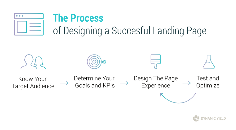
One of the most challenging obstacles to achieving experience optimization objectives is the lack of a clear and concise strategy. While there’s no one perfect landing page creation process to fit all use cases, there are four steps I follow whenever I’m designing a new landing page:
Knowing your market is the very first step in any landing page creation process. Before planning your perfect landing page, ask yourself the following questions:
Fully understand your target audience’s personas and unique needs and, then, tailor your messaging accordingly. If you’ve already collected visitor data with your website or other landing pages, you can uncover some of those valuable insights with your web analytics software. For example, I usually use the Demographics and Interests reports in Google Analytics to understand the breakdown of age, gender, in-market segments, and categories of my audience. Conducting additional surveys and interviews could be a good way of learning more about the pains of your potential customers.
Carefully define the objective and stick to it throughout the entire working process. Make sure you’re focusing on just one objective. This is especially important to eliminate any unwanted choices and unnecessary distractions. It would be a good idea to stick to the KISS principle: don’t make your visitors think too much about actions they are expected to take.
Safely guide them and show them the way to reach their goals quickly and efficiently. The main objective should be clear and prominent on your page. Every single element on your page, whether it’s an image, plain text or a video item, should directly support this one, single, desired action.
Create a very neat and clean design and layout. Start with a simple wireframe and work around it with your UX experts or web designers. A more effective tactic would be to simplify the landing page creation and redesign, which is also one of the most difficult tactics.
Pay careful attention to the fold. While there’s no general right or wrong in planning long or short landing pages, it’s quite important to include your top unique selling propositions above the fold where the page’s initially viewable area exists. That way, you will be able to grab users’ attention faster. Don’t require your visitors to scroll down for the most valuable information you’ve got. Make it pop out!
Approximately 90% of companies consider conversion rate optimization to be important and even crucial to their overall digital marketing strategy (source: Econsultancy). Ongoing landing page optimization is crucial to success. In fact, companies like Google, Amazon, Netflix, and Facebook run over thousands of experiments each year. As Jeff Bezos has once said: “Our success at Amazon is a function of how many experiments we do per year, per month, per week, per day.”
Optimization requires testing, and A/B testing is always a good methodology for optimizing your landing pages since you can never simply rely on hunch or gut feeling when guesstimating what will work best for your target audience. Test different headlines, page copy, page length, structure and element positioning, usage of navigation menus and any changes to the overall design.
Remember, testing is a continuous process, not a one-off procedure. There’s no finish line for an ongoing landing page conversion optimization process. (P.S. You can follow our 4-step conversion rate optimization plan to make it easier for you to build an ongoing CRO strategy!)
Keep in mind that your visitors are diverse, and one type of experience just cannot fit them all. Use advanced audience segmentation and personalization strategies to deliver the right content variations to the right users. The more you test and personalize, the more you’ll be able to maximize conversions and overall user satisfaction and experience.


