
![]()
As I approach the checkout line at a busy TJ Maxx on 6th Avenue in New York City after a long day at work, I am quickly disheartened by the near 50 bobbing heads in front of me waiting in line. Threading up and down three long lanes of traffic, I look down at my items unsure of whether or not I have the strength or willpower to commit to my purchase.
The woman in front of me has a carriage filled to the brim. Clothes toppling over, I wonder if she is tackling her Christmas shopping early or whether the allure of everyday prices and unique finds has officially driven her mad.
Whatever the case, I decided to saddle up for the ride. Once my blood pressure starts to normalize, I find myself assessing the random assortment of items strategically placed along the aisles to incentivize last minute buys. Normally you blow past these items, ensuring some large family doesn’t slip past you in line while you are quickly trying to sniff out a new a sandalwood candle. But with nothing but time, the window for shopping reopens.
As we slowly creep towards the cashiers, the woman in front of me reconsiders a few items, taking them out of her cart and draping them over the end caps. Then, she picks them back up and puts them in the cart where they rightfully belong, adding things as she goes from here and there. I grab a few things, myself, proving even the savviest of shoppers can’t refuse a good deal.
By the time I check out, I’ve spent more than I had originally intended. Albeit on things I needed, I make my way out of the store and out into the light of day, relieved. I have overcome. I am alive, reborn, and with a new lease on life.
Later on, after reflecting on this whole experience, it struck me how ingenious a marketing ploy it was on the part of TJ Maxx to lay out its stores in this way. Supermarkets have been doing it for years with candy (making us feel guilty and glutenous), and Walmart with batteries, chapstick, + other odds and ends, but I can’t even imagine the significance to average purchase value for a company like TJ Maxx.
It got me thinking…
Not surprisingly, after a bit of research, I discovered numerous brands adopting cart page product recommendations. Even better, they’ve one-upped TJ Maxx through the personalization of content based on data including user behavior, preferences, past purchases, and affinities.
In the rest of this article, I’ll address the foundation of an optimized checkout page as well as highlight online retailers who are successfully leveraging the cart page to influence impulse buys with in-the-mood shoppers.
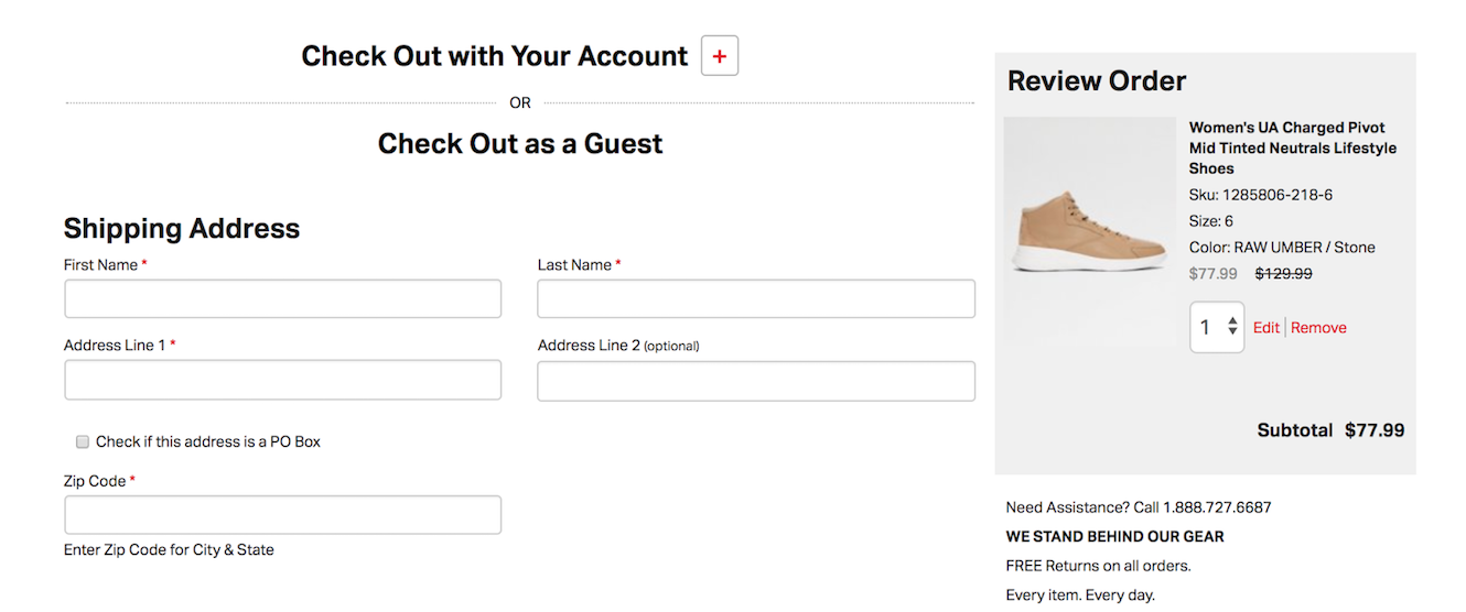
If a user leaves the checkout screen to add another of your wonderful products to the cart, don’t disappoint her by forcing her to fill in all of her information again. In an era of Amazonization, when users can buy in one touch, forcing your shoppers to repeat cumbersome processes at the point of conversion will cost you dearly.
While encouraging visitors to sign up for accounts and loyalty programs is vital to building long-term engagement, this should come second to streamlining the path to purchase. To drive registration alongside purchases, add a checkbox to register next to the pay button with rollover highlighting the benefits of your loyalty program. Additionally, leverage the confirmation email sent after purchase by including a link to complete registration simply by entering a password or connecting a social network.
In an attempt to compete with retailers with massive economies of scale, many eCommerce platforms have over-relied on free shipping promotions which boost conversions but eat away at margins. Rather than offering a promotion, a customer may not need to convert, show several shipping options and only offer an incentive for users demonstrating exit intent.

Furthermore, expose users to shipping options on product detail pages (PDPs) before they add items to their cart. By prominently showcasing shipping information across the site, you’ll answer a key question up-front and help a user enter the buying mindset earlier in a visit.
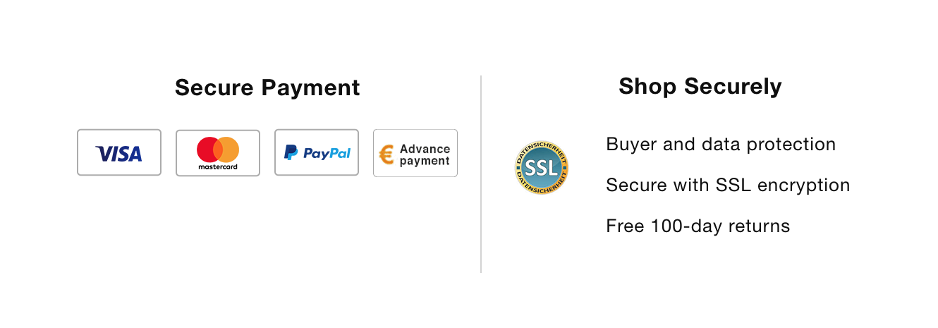
Security concerns rank among the prominent reason users abandon eCommerce transactions. To assure peace of mind, place security badges in the cart that let them know that their information is safe in your hands.
With the rise of third-party sites that promise discount codes (which are almost always false or expired), many eCommerce transactions are abandoned when users leave your site to search coupons on Google. To combat this, automatically pre-populate any coupon a user is entitled to receive in the cart so the correct price is reflected at all stages of checkout.
Additionally, value-based tools can be used to help customers quickly calculate order totals, including information such as shipping costs, tax, and relevant coupons applied.
If you must ask for information that is not obviously needed to complete a transaction (i.e. phone number), explain why you are requesting this information and how providing it benefits the user.
And when it comes to optimizing the number of fields on a cart part, remember that there is no one answer for all users. Be sure to A/B test a variety of elements in your eCommerce checkout flow, including field entries, in order to achieve the results pertinent to your business.
While it seems counterintuitive to address returns, helping users understand return policy has been proven to increase conversions and ultimately decrease return rates. If you offer free returns, be sure to showcase that information on product and checkout pages.

Save users the trouble of going back to a product page if they have last-minute changes of heart about size or color of a product. Implement this feature by including a link next to the product in the cart that opens a separate overlay window.
Prominently display a customer support line or live chat option to help customers with any last-minute questions they have. Of course, this moves beyond simply optimizing the onsite experience though. Be sure to build customer support infrastructure that allows you to prioritize and quickly respond to customers who are inches away from completing the purchase.

According to an original research report by Dynamic Yield, 57% of shoppers say that online retailers can make their experience more enjoyable by making it easier to check out. While mobile UX is a pain point for many retailers across the funnel, design flaws in checkout are the most costly. With 60% of retail traffic coming from mobile devices, copying your desktop checkout flow is inexcusable. All aspects of checkout must be built with the mobile consumer in mind.
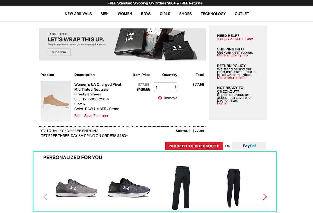
A prime example for all of the key strategies noted above, it’s no wonder Under Armour jumped at the idea of optimizing the cart page.
After checking a few of my favorite category pages (yes, menswear) and clicking on a few items of interest, Under Armour makes sure to surface them, showcasing a section personalized just for me based on my browsing history and other best selling items as a new user.
Those fleece joggers do look pretty nice.
Pairing frequently bought together items with whatever is placed in a user’s shopping cart makes Charles & Keith another early adopter and leader in cart page optimizations.
Recommending complementary products that are typically purchased together with the product currently viewed never looked better, or made a purchase decision easier to make.

While not very different from the bought together strategy deployed by Charles & Keith, the language Ann Taylor uses to surface it’s recommendations sound more derivative of social proof, specifically highlighting the “client.”
Notice also, multiple checkout optimizations have been made to ensure seamless conversions, including info and options related to shipping, the ability to edit items in the cart, login or signup, chat with a live customer rep, and the assurance of safe payment options.


